Space, Light, and Order. Ingredients for a well-composed room.
“Space and light and order. Those are the things that man needs just as much as they need bread or a place to sleep.
”
It’s no coincidence there’s been a heightened interest in home interiors - and baking! A little manna from heaven, so to speak. The desire for creating comforting experiences, at home, has also made meaningful design an important priority. We’ve been looking at our walls and rooms, for a while, either through either sheltering-in-place, working from home, or other activities. We may be adapting to this as our convention a bit longer.
More frequently, I’m receiving design service inquiries expressing a consistent craving for changing up spaces in order to bring better function and comfort. Though sometimes the change requires a more intensive approach, like a remodel, there are also occasions to explore options; a different arrangement for an existing space designed to capture an open feeling with increased light, more balance, and order.
All three elements of space, light and order can be found in this room created by the design team at Thibaut & Anna French Fine Fabrics, Wallcoverings and Furnishings. Notice how the drapery panels actually make the room feel more open with the additional light reflection from the fabric.
Recently, I met with a client to evaluate her home’s main level. Her first priority was the room seen upon entering. It’s a living space. She has a lovely wing chair, a fine secretary, and a beautiful rug. A pair of chairs flank a stacked set of tables and some special art pieces add accents of color. Though she has great style and taste, she sensed something was feeling off.
Her goals are to make this room feel special, tailored and classic but not stuffy. A place to receive visitors while also allowing her to enjoy sitting in her wing chair, looking through the large bank of windows and perhaps to read. Rather than it be treated as a formal living room, it will be used as a library.
One of my solutions for balancing this library would be to customize a new settee by adding a skirt. It could replace the matching chairs to cozy up the room’s end. A round ottoman could be used instead of a coffee table. A giraffe pattern, for the pillows, is playful yet sophisticated. (You can click on the image to see more detail.)
Because all three existing chairs have exposed legs, (including an ottoman that accompanies the wing chair), the room felt a little like a waiting space. Sometimes it’s thought by using a majority of pieces that are more open or with legs, it can make a room feel larger. Quite the opposite frequently occurs. There’s a lot for the eye to process so it feels more occupied.
The proportion of each piece is relative, too. Her secretary creates a lovely focal point, much like a fireplace, so it needs another element of visual weight to balance it. Balance equals order and order equals a well-composed room.
Another glimpse of the classic and fresh twist to traditional design. Photo: Thibaut
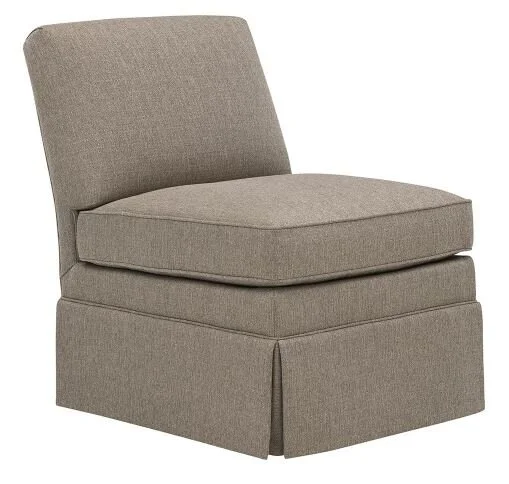
After some discussion and thoughts about a potential relocation, my client is considering another option that would work very well. The armless chair, below, could be used as a pair—either separated or nestled close together, to provide the same invitation of welcome to guests. Each person would have their own seat and in the long run, they may be easier for her to place in a different home. The skirt eliminates the leggy look.
We’ll cover these chairs in a textured material with threads of color, pulled from the plaid wing chair.
We’re also going to have the walls coated in a soft gray. There’s so much warmth in the rug and the furnishings, this will “push” the walls back a bit while wrapping the room like a cashmere blanket.
One of the possible paint colors, Sherwin Williams Gray Clouds.
We’ll lighten the interior of her secretary by lining it with an off-white paint. It will allow her collection of objects to show much better and complement the darker cabinet wood.
It’s easy to become nervous about painting pieces of furniture. If done well, they become works of art. This George III secretary bookcase, seen on 1st Dibs, exhibits a beautiful example.
Our pillow fabric, on the top. Animal patterns add a little edge to your interiors and can remain timeless, when used in an edited manner. Thibaut: Makena Pattern
Finally, we’ll top the room with lighting. Here’s an option we’re considering, among others:
A classic pendant light would be a handsome replacement for the existing ceiling mount fixture. With a ten foot room height and the length of this being 24 inches, there’s plenty of headroom.
I’ll have to leave the bread-making up to my friends with those amazing skills. They can gift me anytime with a sampling! Meanwhile, it will be lovely to see this room fully baked with all of the ingredients we’ve pulled together. I think she’s going to love the results!
Our Design Support Consultation provide direct focus on improving and completing “almost there” spaces.


